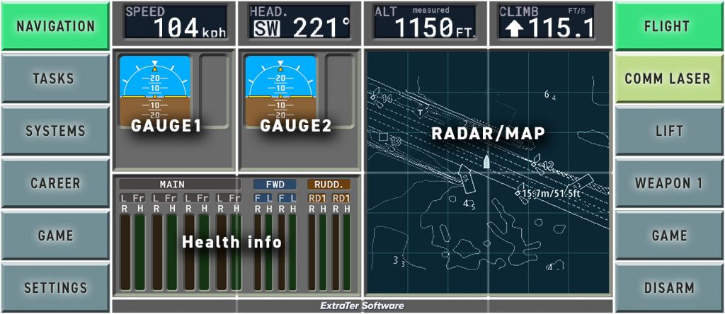
MFD – Multi function Display
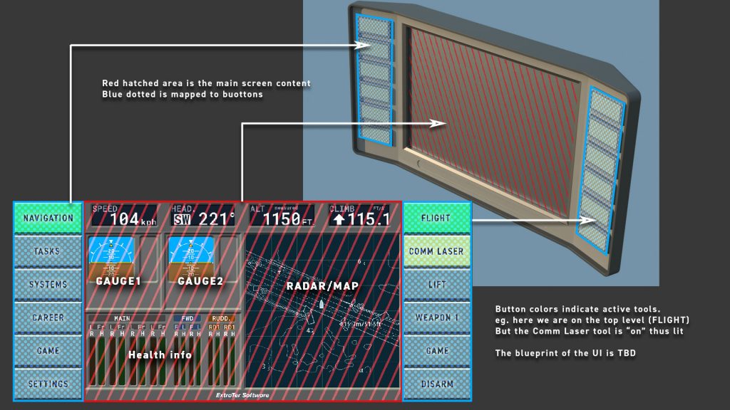
Idea of Patrol Mars game is to have all* game UI, from setting to game loading and career info to tool selection and navigation, inside the main display of the aircraft. An alternate take to MFD (multi-function-display) familiar in fighter planes since the 80s and in some form in modern airliners.** Basically they are screens that can replace several one-function instruments. Typically screens have buttons around the screen to select different views and/or functions.
*all that reasonably make sense
**Well just checked the Wikipedia and late 60s is when first MFDs came to military craft (F-111D) yet Space Shuttle got MFDS only in 1998
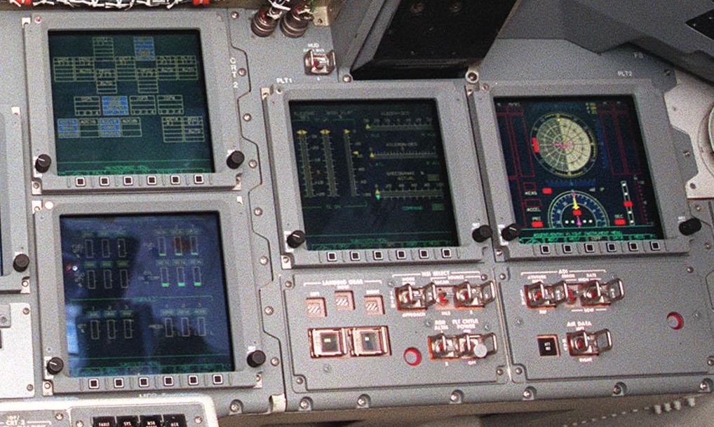
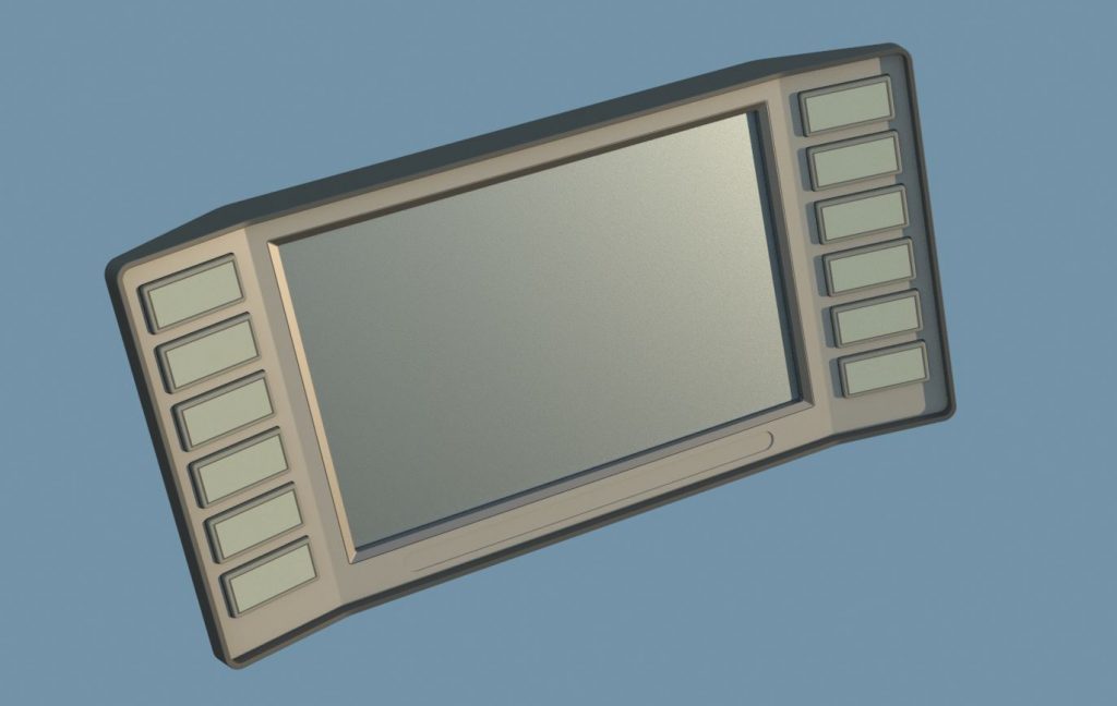
In Patrol Mars Player’s equipment rhymes more with today’s heavy equipment from construction or agriculture so more retail oriented feeling and ease of use is required for the whole ship. The idea is to have one major screen with 90s laptop like design language and context dependent buttons that control different functions.
UX logic and wireframes
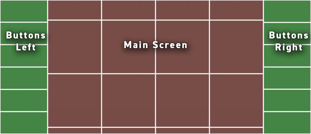
To make the design work coherent and easier, and also to help manage the UI, the screen space is split to modular areas. One element (widget), like radar screen in the example below, can reserve several smaller blocks. The top blocks with smaller size are reserved for instruments that are visible most of the time. The thin area on the bottom is software title area but can also show small non critical notifications. Like the %$#@^& Windows notification thing on the right corner.
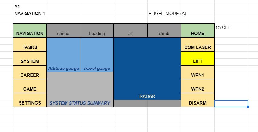
To play with the design, wireframes or rough function flow I am using spreadsheets. They prevent me from getting bogged down with worrying about visuals and as the system layout is very rigid they work well. The examples below are already out of date. The idea is that on the right side you choose the tool. And on the left side you have categories that fall under said tool. Right hand top (Flight) is sort of the home button. Brings you to top level with main flight screen.
Top Level. Here “Flight” is replaced by “Home” as this is the top level default screen. Navigation might be totally redundant here. Note the “Lift” color. Player has lift (winch) active but we are not on the lift screen thus it has secondary highlight.
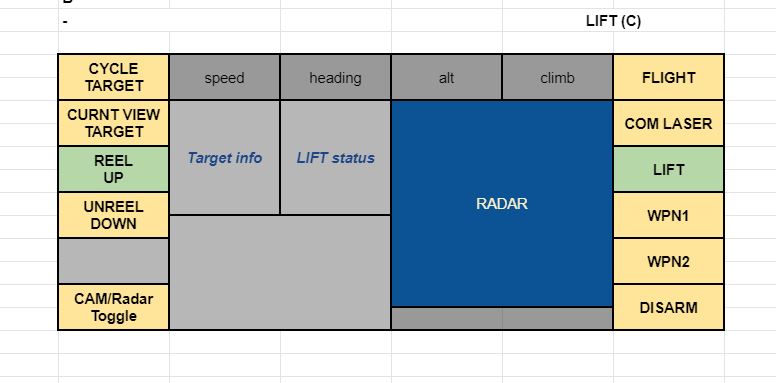
Lift. Below we are on the “Lift” page. It is worth noting that Right hand side functions stay always visible. These are the main things that player needs to access any time. Left side is more context dependent.
Here left side “Reel UP” is highlighted but it probably should be secondary highlight like the yellow in previous example. Also note that buttons can be blank like second from bottom on the left side
Career/Employment is where you access player stats, information of your progress and potentially leaderboards. “Back” is obsolete here as it would take you back to home. The 2 highlighted buttons (Flight and Summary here) are from older iteration where there could be selection on both sides but for sake of clarity I think it should be avoided.
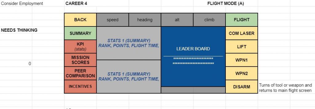
Strategy for organizing the UI
I will be creating widgets for individual gauges, info-blocks and buttons. A page/screen is then built from these element. When a button is pressed a new page loads and besides the page change of visual information new commands are assigned to all buttons. I previously started with a data table that had IDs for all possible block locations and on then with the button press checked a line for that command and rebuilt the screen and updated the commands. In principle it is quite smart but the total number of screens might be so low that building them manually as assets might make more sense. Problem with creating the page from a data line is that the process is totally non visual and there might be enough exceptions that separate pages need to be crafted anyway manually.
Below is example of my current data table for the screens. Buttons and module locations are given IDs. Each row represents differens screen, this _very_ long line lists:
- commands should be assigned to each button (which are “physical” actors in the scene waiting for a finger to press them)
- What mode the button is on: color, illumination, blank etc.
- which widgets need to be placed on this screen
- to which slots those widgets would be placed
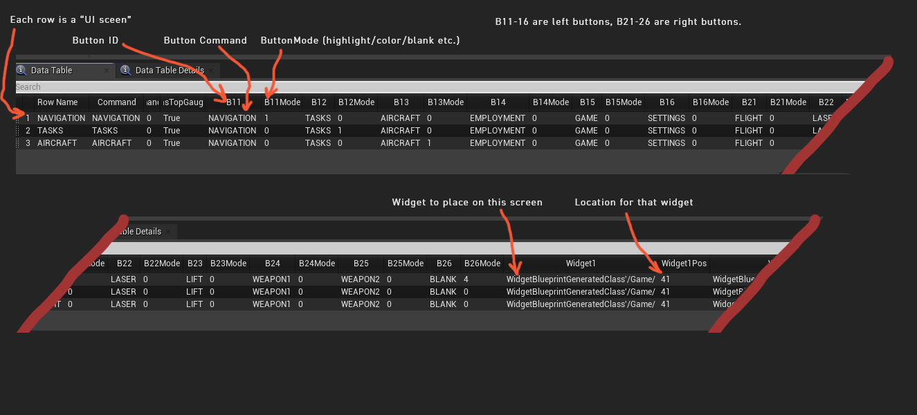
It is not bad but not least bit intuitive.
